Tuesday, October 24, 2017

Pile of Art #2

This is the majority of the art collection I've acquired since the last one of these posts.

I think it shows a bit more of a focused arc than before, but that may just be me reading more into it and no one else will notice.

(If any artist who's work appears here wants me to take it down feel free to yell at me.)


By Gilbert Hernandez

Beto does way to cheap commissions for an artist of his stature.

By Jaime Hernandez

I got this from another Santoro auction. I like that the feet come across as weird, almost like a Barks drawing of Donald Ducks feet, but the faces have this sense of comfortably to them. Jaime's characters are so lived in that this drawing feels more like a photo you'd find in a random album in Maggie or Hopey's home than a commission. 


By Warren Craghead 

Warren's daily Trump drawings have been one of the saddest comics projects of the past year for me, not for an artistic reason, but for the now distant promise that Warren would end the project when Trump went unelected.

In continuing the project, from its intended (and in retrospect, hopeful) stopping point last November, Warren has created a series of artistic short hands and mannerisms that mutate and change on a daily basis in an attempt to try and capture the grotesqueness of the Trump presidency in real time.Warrens choices of symbols are not nuanced, they are bold and pronounced in their meaning, but it is in their slow decay and transformation, from week to week, and even day to day, that these strips become so unnerving to view. Trump transforms in real time; from a sketched off figure composed of a few sparse lines too a slug-like creature that has every bulge and pool of sludge he leaves behind  detailed, the crowds that surround his podium give way to white hooded klan members dotting every environment, T's shift from gold infused marketing brands to burning crosses on the horizon.

This is a reproduction of an illustration Warren produced based on a Trump quote demeaning John Lewis. I think it remains the most hopeful of Warren's drawing's.


By Heather Benjamin

I've been wanting to get something from Heather Benjamin forever. I think she was clearing out her studio and randomly put up a ton of originals, so i finally pulled the trigger on this one. I like that it checks off every Benjamin box, wild hair, menstruation, insects, eyes that pierce through you etc.


By Anya Davidson 

Anya was selling off the back stock of School Spirit she had purchased after Picture Box closed. She also added small drawings as a bonus item.


 By Booger Brie

When I went to TCAF in 2016 within 5minutes of meeting HTML Flowers for the first time he dragged me over to Brie's table and began explaining to me why she was the best new artist in the building.

I've been a fan of Brie's work every since that table side lecture.

One of the things i enjoy most about Brie's work is that fashion seems to take over her figures bodies, faces, and gestures. Acts of physicality seem to be more a conduit for the clothing to move and flow forth from than actions that these beings chose to do of their own fruition.

I just gave Brie a one word general theme for this piece, fashion, and this is what she sent me. I think it later appeared in an issue of Kus! with some slight modifications.


 By Mickey Z

Mickey Z was doing a weird kinetic twitter commission system where if you dm'd her a request, PayPal'd her $25(?) she'd knock out a color marker/crayon drawing that day. I went with Werewolf Jones because i thought he fit in with the frantic nature of the process as a whole.

 By Tim Hensley


I'm infatuated with Tim Hensley's lettering.


By Nou

I think i just told Nou to draw whatever they wanted at whatever size they wanted in color and this is what i got. I'm the worst person on earth at requesting commissions.

Nou might draw the best flowers in comics. She's definitely the best at drawing figures with piercing eyes.


By Lale Westvind

This is a Lale Westvind drawing of Big Barda. It is probably the best drawing of Big Barda not drawn by Jack Kirby in existence.

Lale has a power to her line that i don't think many cartoonists can equal. It's something that forces Kirby down your throat, but doesn't exclude or ignore the shakiness of Karl Wirsum or Gary Panter's line.

I'm kind of in love with the glee Westvind draws Barda with, she's just jumping around punching the air so hard you can see thunder. 


By Carta Monir

Carta, i think spurned on by the last one of these posts, adopted the $5 postcard drawing idea for a few months. They went above and beyond what i originally thought these kind of throw away art items could look like.

I've always loved the red triangles in this image.


By Julia Gfrörer

I bought this at MICE a few years ago. It was the first time i think i ever met Julia. It's a page from the anthology Bad Boyfriend.

I try to buy an original from Julia every year. It's a good system. Everyone should try it.


By Connor Willumsen

This was a kickstarter reward for funding the comics rowhouse residency Frank Santoro did a few years ago. I think you can still actually get one through the site.

Connor gave a few prompts and general idea's of what he'd be into drawing and i went with Orion from New Gods. Connor is definitely someone who you should let draw what he's into if you ever get the chance to buy an original from him.


By Joshua Cotter

Joshua had a box of loose pages at TCAF last year with a sign saying something along the lines of "priced to haggle". I payed whatever price he initially quoted me at though because im an awful haggler.

The bottom page is a set of instructions for preforming CPR. I don't know if it was for commercial work, or if Joshua made it on a lark, but every time i look at it i feel oddly relaxed. I have no idea why.


By Tommi Parrish

This is the (current) header image to Sequential State. Within 24 hours of Alex posting it to his site i was already in the process of purchasing it from Tommi. If anyone ever wondered what kind of person i am, i think that explains it pretty well.


By Patrick Kyle

I like that this feels like a strange cover you'd find on a quarter bin sci-fi novel from the seventies.


By Laura Lannes

These are the opening and final images from Lannes comic in the (self-edited) anthology Bad Boyfriend. Theirs a way that blacks and whites seep in and out of that comic, how the text erases itself and doubles over itself to explain the feelings it is searching for. It shows trauma through a rising and receding level of ink on the page, that i think these two panels capture quite well/


By Gloria Rivera

Gloria's art captures an intimacy that escapes comics at large. Her work feels delicate and loving. The way Gloria draws the bare back in the top right panel, a girl walking her bike down the side of the road on the bottom, feel like distillations of  fleeting moments. Like snapshots of a loving memory, rather than panels in a comic. Gloria's work has this way of dealing with the immediate, but also the infinite.


I've been going through the Picturebox back catalog a lot this year, and made a concerted effort to get all of Chippendale books i'd been missing. 

I like how dense, but clear Chippendale's pages are. Theirs probably a dozen plus figures on this page but it's clear all the way through who's who and what's what.


Monday, September 11, 2017

The Louvre


What does a black ear, a curly q, and a jagged black line mean when they are all absorbed into the same entity?

Ken Kagami’s Freak Dog and Freak Boy takes the classic Peanut’s duo and explores how their iconography relates to both of them as independent bodies, but also as a singular being. Charlie Brown and Snoopy are linked for all eternity, from christmas specials to insurance conglomerate ads, they exists in the same breathe as each other. What separates Snoopy from Charlie seems to be at the heart of Kagami’s drawings, but as the leashed Charlie Brown on the cover makes clear, they are joined together for all eternity. They are one, but not one.

Kagami’s lineweight never changes. It creates a deadness in style that refuses the idea of flair. In this refusal though, Kagami allows the iconic nature of Charlie and Snoopy to shine through his drawings. Charlies jagged line shirt permeates any amalgamation of bodies and shapes Kagami decides to place the duo within, from beaker to chess set, they are both individually identifiable but always inseparably together.

Snoopy and Charlie are bound. Every configuration Kagami places the duo in means something different, visually, but it is always the bond between the two that is being reinforced. An inversion and examination of Schultz’s repetitive gags, Kagami utilizes the iconography of Schultz’s line and figures to explore what the bodies surrounding these icons mean.

A monstrous shape reforming and deforming, but always keeping the same elements.


************************

The footballs never pulled out, it is just absorbed alongside those playing with it.

Sunday, May 28, 2017

Slippery


A Diary: Gold Bunny
By Nou
Gold Bunny is a sketchbook. Pictures of graffiti make up its limited page count. But it is the way in which these images interact, and react, to the surfaces they are being created on that is at the heart of Gold Bunny. There are two surfaces Nou’s art appears on, those created through physical mark making on public surfaces, and those created through the acquisition of public resources as a surface for mark making. Ink infused onto concrete, and stickers adhered to stop signs. It creates the question of a narrative. Texture as a form of appropriation and art. A condensed version of a city wide art project, a comic made up of photos of images being made, and of images already made. The thought of mass consumption made out of white out and stolen postal stickers.

~~~~~~~~~~~~~~~~~~~~~~~~~~~~~~~~~~~~~~~~~~~~~~~


Clean Sweep
By CF

Lines printed on paper as delicate as capitalistic interests will allow the receipts of their transactions to exist on. The infinite scroll recreated within a finite number of inches, but requiring you to be careful at every moment of its unraveling or else it will tear from the sheer presence of your touch.


~~~~~~~~~~~~~~~~~~~~~~~~~~~~~~~~~~~~~~~~~~~~~~~


Christmas In Prison
by Conor Stechschulte

The binding of this book is so tight it seems to be trying to close itself in your hands.
Keeping the pages open becomes an active pursuit.
///////////////////////////////

A book of a dozen titles, Christmas In Prison is a disjointed work of obsession filtered through a collection of odds and ends. Every page of every story reads like the idea of someone trying to figure out what exactly comics are, and can be.

~~~~~~~~~~~~~~~~~~~~~~~~~~~~~~~~~~~~~~~~~~~~~~~


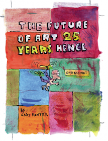
The Future of Art 25 Years Hence
by Gary Panter

Watercolors or film overlays. Otherworldly vehicles and art theory discussed by half wits and geniuses. Panter drops a gem of a comic between the advertisement filled pages of an art magazine that buried it in the back pages.

~~~~~~~~~~~~~~~~~~~~~~~~~~~~~~~~~~~~~~~~~~~~~~~

Blaise Larmee1
By Blaise Larmee

(You can no longer read this comic online)


Two pixels by two pixels, grey and white boxes show a screen loading as slow as a dial up connection.

///////////////////////////////

A Slug traverses the entirety of this comic.

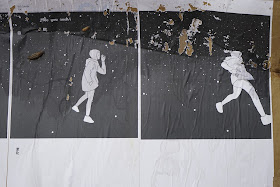
Not a figurative slug, or the metaphor of a slug, but a literal slug. Moving from the upper edge of the panel to the bottom. Sequenced through a series of photographs of a single repeating panel, Larmee reconfigures the way the reader interacts with a comics panel. Every second the slug inches towards the right side of the page a new photo is taken, creating a new way to interpret the the weather battered image.

Angles and rain damage.


~~~~~~~~~~~~~~~~~~~~~~~~~~~~~~~~~~~~~~~~~~~~~~~

Tuesday, March 28, 2017

Interview: HTML Flowers


Corporate logos appear throughout No Visitors. How do you feel about medical care being used as a venue for advertisement?

i grew up going to the ronald mcdonald house for sick kids, at some point when i was older i realised the conflict of interest there. Being a corporation that by many accounts does nothing to aid society and a lot to fuck it over for it's own interests... we're the band aids, sick kids are used to make these super powers seem socially responsible. I Was A Disabled Child Mascot For Ronald McDonald.

it's a necessity for hospitals to accept corporate funding & collaborate with major conglomerates because we as a society have decided to say yes to governmental policy that believes there should be a limit to the funding afforded to medical industries and venues. i'm disgusted by the need for any charity at all. tax Mayor McCheese & free the sick.

Is drawing over medical paperwork an act of vandalism, an artistic gesture, or just the utilization of available resources?

i guess it's like reclamation. forcing these little sterile documents that archive the maintenance of my rotting body to acknowledge me, who i am. cheesy i kno. also tho sometimes ur just bored waiting for a test or operation so u just start drawing on forms u find and shit. sometimes u gotta sit around waiting for up to four or five hours to get x-rays etc. and because of insurance reasons u can't leave the bed they have u in sitting in some fucking dank hallway with some orderly watching u so u borrow a pen and draw on whatevers around.   


In No Visitors and your work on Werewolf Jones and Sons their is a strong dislike exhibited towards institutions, but while Werewolf Jones is able trash the principal's office after he questions his ability to parent, Little seem unable to perform a similar act of catharsis when it comes to the hospital.  How do you think these institutions play into these responses?

lol strong dislike of institutions is my brand, my social worker says i have an oppositional defensive attitude towards all forms of authority.

Little doesn't have the same options as WWJ, if Little alienates the hospital staff too much or committed aggressive acts towards his "carers" he would receive substandard care, in the least, or worse be banned from the hospital altogether and it wouldn't stop there, wherever he went after that he would be marked as a violent, aggressive patient. also WWJ acts almost entirely on impulse and doesn't give a fuck about jaxxon & diesel's formal education. i exposed my drip and spit at a gang of fucks who were gonna beat me up when i was out for a walk near my hospital like 9 years ago (lol my hospital is in a bad neighbourhood) which is where that came from. it really worked lol.

There's a greater focus on storytelling in No Visitors #2 compared to your earlier work, has your thoughts on writing comics changed?

i started trying to really talk about my life in a simple, non fantasy manner. i wanted to build something, see myself changed or change things about my life that i can't go back and change. show people how painful, rare & sometimes beautiful life with a chronic illness is. No Visitors #1 is basically just scraps and shorts that were all a part of the lead up to developing Little & his lifestyle, in fact i don't really consider the series properly starting until No Visitors 2. i've been working up to this for years, now i've arrived and i feel so much myself. i feel like i'm really making the work i'm supposed to have always made in a weird way. lol destiny.


Is bluntness important to you?

extremely. tell a good story in an easy way is what i try and stay true to whenever i write.

Who are your top three cartoonists who have also leaked their own nudes?

Charles Burns for his pioneering use of baby oil, Dan Clowes for his commitment to #nofilter nudes only & of course who could forget Johnny "The Mole Rat" Ryan for his immaculately hairless body hiding underneath all that flannel.    


You can purchase No Visitors along with other work by HTML Flowers here.