Saturday, August 30, 2014

The Faithful Hussar

 
Goddamn This War ! (Fantagraphics)
by Jacques Tardi, Jean-Pierre Vierney


* Goddamn This War ! tells the story of the First World War through short vignettes, more journal entries than narratives, of an enlisted french worker as he moves from front line to front line over the course of the war. There is no large narrative being told in Goddamn This War !, even the short stories that composed It Was A War Of The Trenches are left behind, there are no beginnings, middles, or ends for our narrator; no last minute heroics during the climax of a battle to save his best friend from certain doom with a tacked on voice over about how war ruins all. Hemingway's romanticism of war is dead, bashed by artillery into dust. The war simply begins and ends. The narrator survives, but like everyone involved on the front line he is left maimed in one way or another.

If 'Goddamn This War!' could be said to have a narrative at all, it is the author's search for a reason for it all, the bloodshed and destruction, but by the books end all he seems to be able to come up with is nothing..


* I’m of two minds in regards to the title Goddamn This War!, the literal french translation of ‘Putain De Guerre!’ is ‘Fuck this War!’ and while that title (as Kim Thompson joked in a discussion on Tardi’s body of work) was likely to cause some problems at the distribution level, its name rings far truer to the intent of the work than the less crude Goddamn This War!. War is vulgar after all, and Tardi is well aware of this fact.

The inclusion of God in the title is interesting, it can either be read as an ironic appropriation of God, similar to the way the governments and militaries appropriated ‘God’ to lure the masses to their side during the war effort. Tardi does hint at this reading in the text by turning the Tommies (English) slogan of war “‘God and my lawful right’ against the Germans” in on itself, picking the slogan apart by questioning whose God is the true God if each nation prays to him, “another hypocrite with a finger in every pie” he emphatically states, eventually re-configuring the quote to fit his own view of events “Each for himself and God against all”. This leaves a sacrilegious bend to the title that, within the context of the work, puts to the forefront an important aspect of it.

The problem with the use of Goddamn though is that it elevates Tardi’s attack on institutional religion and its place in promoting the war, thrusting this singular aspect to the forefront of the readers mind. Tardi, throughout the work though is attacking the Military, Religion and the Government all at once, so by placing one explicitly in the title it seems to be taking away from the attack on each of the three and highlighting, to the detriment of the others, the attack on just one. Fuck though, fuck this and fuck that and fuck you you mother fucker, has a ring to it. It can be related to any and all of these institutions. It is universal in its vulgarity.


Fuck. 


* As the book goes on our narrator’s sense of detail diminishes. The first chapter, 1915, includes an elongated battle scene from his point of view, and is preceded by several pages of his company marching in parade like fashion through various French towns on their way to the front line. We are given details of the battle, including an interesting sequence depicting an ill fated cavalry charge which (as one would suspect) did not turn out very well in the face of modern artillery fire. This is our narrator's first battle and it is the only one which he gives such intimate detail. The first chapter is almost wholly consumed by these two actions, a march to war and the first military engagement. In contrast during the the final year, 1918, we are treated to a series of pages illustrating the death of nearly a dozen individuals. These deaths are told in a manner that makes them seem like more of an afterthought for the narrator than important moments in his life, each event receiving at most two panels and a few lines of narration documenting their lives and death, details in addition to these two are few and far between. It reads like a frightful recap, like a stand up realizing his ten minutes on stage are almost up and rushing to the punchline.

* Goddamn This War! is the first work of Tardi’s that I have seen in full color, or at least the first few pages of 'Goddamn This War!' are in full color. As the story progresses the color is sapped away, page by page, until it turns into an overwhelming grey-wash of bleakness as the murk and mud of death overwhelms the pages both visually and narratively.

It is not until the final year of the book, 1918, when victory (or whatever one wishes to call it) is achieved that color starts coming back to the narrative. 


The color is not to be seen in the idyllic fields of France, where the first battles took place and Tardi’s lush colors made you think that they would be a wonderful place to have a picnic though. Nor does color return to the small towns that litter the French countryside, that Tardi so beautifully brought to life as the French army proudly marched through them on their way to the front line. It certainly does not come back to the faces of those who fought in the battles, even though the first time we saw them, in their brightly colored and ornate uniforms, they looked so full of life.

Death contaminated them all, their color is lost.
No the only objects that regain their colors are those which glorify the country and the war. The allied powers flags, which are waved in the streets of Paris when victory is declared, are given back all the vibrancy and luster that they had on the books first page. The medals of those who served, like the one pinned on a man slouched down on a street corner next to his crutches begging for money, are granted a new intensity that that man they are pinned to will never have again. 


Since it was the country that won the war, it is the country who is given the promise of a future. A fresh coat of paint. Not those who had fought in the battles, they are always and forever to be tinged by the grey muck of what they saw and participated in.


* Fantagraphics used a different paper stock for this Tardi collection, it’s of a glossy ilk. I presume they changed the paper to make the colors (and lack of colors) pop, which it does, in a manner in which i am doubtful their default Tardi collection paper could achieve.

* In addition to the change in paper stock this is also the first Tardi collection with a substantial “extras” section, which seems to be a lengthy history of World War One with special attention paid to the events Tardi references. I also believe some of his reference photo’s may be included in this section, but I may be making that up. 

As much as I enjoy the Tardi collections I always felt they lacked in this area, a nice series of introductions or a multi-part biography that spanned each collection would be something I would have really appreciated, especially since before the most recent issue of 'The Comics Journal' I have read very little about Tardi’s life and work.


*an altered version of this post originally appeared on The Chemical Box.

Thursday, August 28, 2014

It Was A Video Installation Of Linda Ronstadt

Hollow #1 - Sam Alden


(1) motion and games

You see Sam Alden playing these games lately. Boxing himself into corners. With Wicked Chicken Queen each image needed to both convey the narrative and exist as a representation of the island the story took place on. No panels. One image per page. With his pixel art he’s using a bootlegged and glitchy copy of MS Paint that sometimes doesn’t allow him to erase sections. After deconstructing his artwork to the essentials, a graphite pencil and paper, Alden’s line can’t be reduced any further. So instead he plays these games.

Hollow follows motion like energy, waiting for a spark to appear and then following it until it burns out. Opening on two teenagers talking about the “Hollow”, the economics of summer beach homes, and Lara Croft: Tomb Raider we watch one of them craft an apple pipe, but following a few hits it is knocked over and the contents housed inside fall into the sand.

They decide to go home.

Alden uses the comics equivalent of a single tracking shot here, following them as they walk the length of the beach back to their home, showing each step the characters make, each gesture, creating an animation like feel. During their walk one of them begins telling the story of a dog attacking her younger brother. Instead of telling this bit of backstory as a series of talking heads (comics is a show don’t tell medium) or breaking the shot and moving into a flashback, Alden instead visually incorporates the story into the scene itself. As all the chaos one would expect a dog attack would entail interweaves between the two teenagers footsteps; the shot continues. They go home.

Reminiscent of Blaise Larmee’s 2001, Hollow feels like animation. While Larmee stayed away from boxing his figures (explicitly) within a grid in 2001 Alden, needing for his story to work as well in print as on tumbler, fixes Hollow within a two panel grid that is so unobtrusive that you hardly recognize it being there. This grid keeps the eyes moving downwards, in one fixed position, instead of darting side to side and breaking the reading continuity.

Like many of Alden’s works this story has a precursor of sorts, the soon to be released in book form Hawaii 1997, but where Hawaii 1997 relied more on dreamlike steps, blinks in between moments that land you fifty yards away, Hollow is more stringent in conveying its motion, focusing on each character's individual movements, not just where those movements lead you. Both ways work in their respective stories, but you can see Alden trusting in his own abilities more and more with each project, which make the games he is playing all the more interesting to watch.

(2) textures

Alden draws his comics on paper. A holdout in the digital age. This requires that each page be scanned onto a computer for publishing purposes. 

In the act of scanning each page you can see the hint of additional textures on each page, not created by the scanner, but by the object that is holding the page down. For the majority of the book it looks like this object is a block of wood, with long horizontal strips of dark and light matter appearing in the deep background of the images. This added layer feels at home with the page though, the texture creates a naturalism that was absent before, a warmness to both the beach and the household, creating a graininess to the page that resembles a deck blasted by sand over the course of a decade.

For a short three page segment though another object appears in the background. When the two teenagers are down on the beach and talking about the mysterious event known as the “hollow” you can see the imprint of the words Beautiful Darkness scrawled over the top of the page. Beautiful Darkness is a comic published by Drawn & Quarterly, the ad copy describes its plot: “Join princess Aurora and her friends as they journey to civilization's heart of darkness in a bleak allegory about surviving the human experience”. While Hollow is not a fairy tale, or at it hasn't been reveled to be yet, it does seem to be mining a similar thematic space. Underlining horror. 

The title, Beautiful Darkness, also has another meaning in the story. The Hollow takes place during the night, when the children are inside, the doors are locked, and their mother can drown the noises coming from outside out by raising the volume of the TV. You are left wondering what is out there in that darkness though, maybe it is something beautiful.

(3) a little on plot


There's a horror in Hollow, something tingling underneath the surface that is not for us to see quite yet. One of Alden’s strengths, and a continuing plot device across his comics work, is the unveiling of what lurks below. The Wicked Chicken Queen slumbers across each of his narratives, but he paces her arrival so effortlessly that you don’t feel yourself waiting for the reveal, but rather revel in each moment, each composition, each line leading up to it.

Even if this was a one off, which Alden has said it is not, Hollow stands on it’s own. Maybe you don’t need to see the monster, but instead sit in the parlor and watch a movie with your mother with the volume jacked up high enough so you don’t hear what's going on outside.

Oh sorry, that’s not actually their mother. It’s someone else...


(4) endnotes - places to read, places to buy and henceforths


He also has two new(ish) mini comics available online The Wicked Chicken Queen published by Retrofit Comics, and  his pixel art comic from Sonatina Comics.

Monday, August 25, 2014

Open Up Your Murder Eyes: Part 1


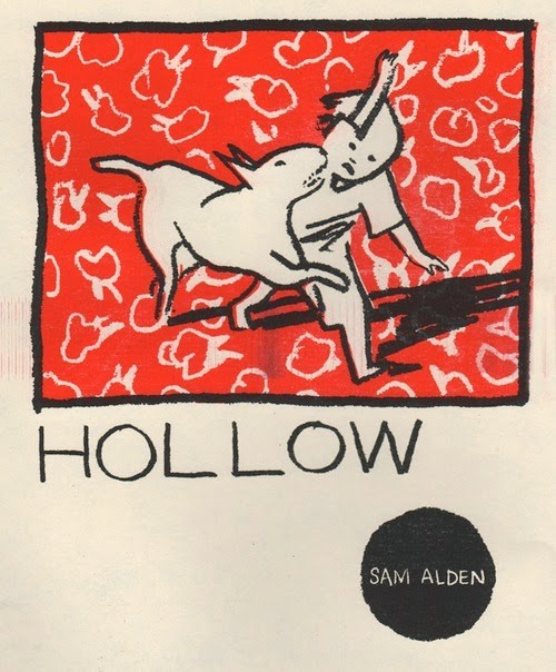
(1) what is a / what is a / what is a / what is a comic book...

I've been reading a lot of comics recently that stretch the boundaries of being classified as comics. The Tom of Finland: The Complete Kake collection, which came out a few months ago from Taschen, consists of 700 individual paintings that, when placed next to each other, form a series of comics. Each page of the collection is given over to a single painting and each series of paintings is given over to its own chapter. This sequencing creates motion between the paintings that is not present when left on their own. As individuals. I’m unsure though if this motion is the most important element in transforming these paintings from individual objects into “comics” though. 

However large their bulges are.

*****

Exorcise is a collection of work produced by Heather Benjamin between 2010 and 2013. Benjamin, while prominent in the art comics scene (being a featured guest at the 2013 CAB) does not make what one would call “traditional” comics. Like Tom of Finland, Benjamin creates single images, but these images do not create sequences when placed next to each other. Or at least not in a literal sense. Characters in Exorcise do not track across the length of the book, they are devoid of arcs and don't move from one setting to the next. They are trapped in these images. But it is in these singular images that the strands of a narrative begin to form, as each drawing builds on the previous, their shared use of imagery, iconography and theme begins to create something that the reader can cling too. These strands are not simple to follow though, they force you to reconcile what is on the page and what is on your mind. It is a personal narrative that is created, not a universal. 

This is me grasping for mine.


(2) "shut up" and covers

The front cover of Exorcise is fairly plain. The title is spelled out with some flair, but the blue card-stock leaves you feeling nothing, it gives no hints or clues towards what the contents housed inside of the book may be. It is utterly blinding in its sheer normalcy. That is until your eyes glance over the neon orange sticker placed slightly underneath the title. The sticker reads “ … Not For The Timid” and features an illustration of a woman bleeding from her eyes, scalp and mouth with her hands tightly griped around a barbed whip. Her eyes are dead black, they don’t express pain though, as one would suspect, but rather pleasure. 

This is the first and only warning in the book. Her eyes tell it all though.

“...Not For The Timid”


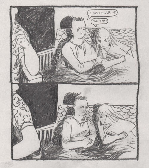
The first page shows another woman. A new woman. She is angled so that we see her right shoulder sticking slightly up as she holds out her right hand towards the reader and makes a gesture that could possibly be recognized as a peace sign. With her left hand she is in the process of slicing her left nipple off with a razor blade. Nothing is holding the breast in place so it moves slightly upwards due to the force of the blade. She is biting the bottom of her lip so hard that it starts to bleed. It seems like a moment of release is happening. Like the woman in the sticker there is a passion in her eyes that looks through you. Cuts through you. She is wearing a single ornate hoop earring, the script, which takes up the the majority of the earnings surface area, reads “Shut Up”.

While the image itself is disturbing it is the “Shut Up” that your eyes linger on. It’s almost offensive in its bluntness. Even when viewed within an image of a woman cutting off her nipple, while simultaneously bleeding from several other sources, it’s those two words that shock you. It reads as an accusation towards your thoughts, your disgust at the object you’re holding. Existing on the same horizontal axes your eyes may glance back over to the figures hand gesture for a moment, the lazy peace sign, and it becomes even more revolting. Like being shushed as a child mid thought by a teacher. It's a fuck you from a figure with black eyes that doesn't give a shit about you though. 

We see this figure once more at the collections mid way point. She is the only figure repeated in the book, which makes her actions seem all the more important. This time she is holding a pair of scissors, instead of a razor blade, and is in the process of cutting off her own tongue. Her earring, still prominently displayed, continues to read “Shut Up”.


Benjamin’s work on the surface seems connected with the Japanese Ero-Guro aesthetic, which in essence is torture porn. Or gore porn. Which ever one you’d like to call it. But Benjamin's recent work doesn't share the same end goals, or even the same point as Guro. It is more personal and transformative. In Guro the rampant theme is the exploration, or more so the infliction of, power over another. This shift in power dynamics has a tendency to lead to the torture and eventual murder of the person in the submissive roles, in increasingly disturbing scenarios. In Guro the outside is the force of subjection. In Exorcise though it is about the power dynamics of the self. The subjugation and domination of ones body by ones own hand and by ones own consciousness. Her figures inflict these tortures on themselves for any number of reasons, but it is them doing it. Both internally and externally they are in complete control, no one else.

These tortures, as uncomfortable as they may make you feel, have a point though. They are made to create a thought. A reaction. Both in this book and across her body of work.


When the figure on page one says “Shut Up” it is as much an act of rudeness as it is an act of asking the reader to wait before they finalize their reaction. A plea to finish the work before questioning it. On the inside front cover there's a small inscription inside of a heart that's being stabbed through by a knife which says “Never Can Say Goodbye…”. On the inside back cover this image is repeated, but this time it reads “Goodbye My Love…”. She is chiding you along, poking, prodding and even provoking you to get to the end, going so far as suggest that you cut out your own tongue to get you there, to the end, before speaking your peace. And at that moment, when you flip the final page and close the book, you remember that you never actually saw that girl cut her tongue off, like she did her nipple, just threaten too, and that is when the story is yours to judge. You were never silenced, just told to shut up for a bit.

“Goodbye…”


(3)  I finished the book so here are some thoughts: a comparison between Exorcise and Sad Sex 

In Benjamin’s previous series/collection Sad Sex every sexual act is accompanied by tears. Sadness is ever present, and while Exorcise has equal levels of bodily fluid the tears have largely dried up. It reads, or looks since their is no written narrative, as a work following the outpouring of emotion. 

The title of Sad Sex is quite literal in its meaning. There is an underlining disgust towards the acts that Benjamin is depicting. Not in a prudish sense, a prude could never depict these thing, but rather a fucked up feeling towards them. The figures cry and sob and writhe because everything seems off. Weird. Inorganic. Benjamin’s figures in Exorcise though are depicted as posed models, appropriating everything from rap iconography to pin up girl aesthetics, they present a level of confidence in their sexuality that the figures in Sad Sex could never hope too. They are putting on a show for the reader, while before they were hiding from them.


In Sad Sex bodily fluids and hair were used as masks to literally obscure the individual, to hide them both as people and as sexual beings. In Exorcise though these details are used to highlight each figure. To define them, and project themselves outwards for what they are, clad in fishnet stockings and fur coats.


(3.1) Hair On Your Head / Hair On Your Legs

I Masturbate Thinking About Your Boyfriend. I’m Sorry. I Would Never Do Anything About It” is most likely the best known image from Sad Sex. It's definitely the most striking. The title is a half hearted apology to someone never named or indicated, and who probably would never recognize it as being about them (or their boyfriend). The illustration shows a woman masturbating with a dildo as she leans back against the wall and tiled floor of a bathroom stall. She is sobbing so hard it is difficult to make out her face, which is then made even more obscured as her hair takes over the majority of the two page spread. Flowing wildly everywhere, the hair masks the figure both from the reader and from herself. She is hiding something that she thinks is wrong, that she acknowledges is wrong, but  "Would Never Do Anything About". 

This is something the the woman of Exorcise would never do. Or at least they wouldn't hide it. Especially with their hair.

While Exorcise and Sad Sex both make a point to keep all the body hair below the neck natural and ungroomed, it’s the hair above that primarily becomes the point of contrast between the two series. Sad Sex is littered with frizzed mullets, un-kept perms and any other number of hairstyles. What they all have in common though is that they exist to hide the person they adorned; in their blandness they make the person not worth looking at in any detail, refusing your lingering eye, and in their length they physically obscure the figures face and body making identifying with them impossible. 


In Exorcise though hair is a thing of beauty. Rendered in fashions that seem impossible outside of 
magazine shoots and runways. They exist to accentuate the figures. To keep your eyes on them. To individualize them. Hair in many cases takes over the entire image as it flows wildly and without care around the page, but while it may obscure the backgrounds it never obscures the individuals face. The hair and face live in a symbiosis, needing each other to create an individual worth starting at. Benjamin wants you to look a these woman, to admire them, maybe even obsess over them like she did while drawing them. The hair is what holds your eyes. 

But the face is what it focuses on.


(3.2) Faces, Identification and Emoticons

Benjamin has a proclivity to use emoticons in her work, but she does not simply use a happy face to convey happiness and a sad face to convey sadness, what she uses them for is their sheer blankness which she contorts to become a source of conveying deeper more ingrained and complex feeling about her figures. 

There's a two page spread in Sad Sex which depicts a series of babies adorned with emoticon sad faces floating aimlessly around the page. The image isn't so much unsettling for what it is in the abstract, but rather the helplessness that there faces show. The only way in which they could convey this feeling was with a line bending slightly upwards in the middle and downwards on the edges, creating a frown. Something a four year old couldn't even escape the meaning of. Surrounded by tears and weeping eyes, it is that frown that makes my stomach churn. It's the personification of despair in one bent pen stroke.


In Exorcise we see a variation on this emoticon-ography, but across the work there is a distinct lack of sad faces. Instead smiley faces adorn most of the backgrounds. These faces tend to be formed when two eyeballs are shown jettisoning out of a figures eye sockets and being met mid page by a ) forming a kiche smiley face of sorts. 

In contrast to the sad faced babies from Sad Sex, which McCloud would argue (and i'd be forced to agree) beg the reader to project their own likeness onto them and thus internalize their sadness, the well defined figures of Exorcise don't allow for this. Instead it is the other way around, they project their own internal feelings onto us. Taking pains to display their smiley faces at a great enough distance from the dagger being dragged across their chests and into the upper regions of the page where your thoughts won't be so clouded. Where you won't be so quick to judge.


(3.3)  blood and vagina's

While blood pours out of almost every orifice in Exorcise, one of the most prominent forms is menstrual blood. This fascination with menstruation is expressed both through the repeated cosmological symbols (stars, moons and constellations) which litter the backgrounds of almost every image, but also through the literal act of bleeding. Interestingly though, for a Benjamin comic, this bleeding is not caused by self inflicted wounds but rather occurs naturally within the female form. It is, along with the figures dress, body hair, surroundings, and faces a reiteration of their own femininity. But while it is a focal point in many of the books images, its existence is not shown as something other, like the blood coming from self inflicted wounds, but rather as something that simply is. 

The woman in the figure above is kneeling, arms outstretched, attempting to pick a rose from a bush and being cut by their thorns. Her hands are bleeding heavily. The rosebush also seems to be bleeding, but by how the droplets are formed they seem more to resemble the rain coming from the clouds above, than actual blood. Her hair and the flowers work in tandem with each other to draw the readers eye to each other, so the false blood seems like another way of accomplishing this. As the bush and hair flow across the page, they react to each others presence, advancing when one element retreats and retreating when the other advances. The woman, in addition to bleeding from the hands due to the thorns is also menstruating. Her bleeding fades away like the rain clouds that make up the background though as her hair and the rosebush take center stage. This form of bleeding is simply another part of nature. Another part of the image. 


The few instance of vaginal bleeding to be found in Sad Sex though are not, as in Exorcise, seen as natural occurrences. They are rather things that are forced out of a woman.

In the section titled "Blood Money Shot" we see the majority of Sad Sex's instances of vaginal bleeding, the most explicit of these involves a female figure holding a large syringe shaped object smiling in front of another female laying backwards and bleeding profusely. It is not shown whether the object had caused the bleeding, but the syringes medical and phallic nature leaves the idea of violent insertion high on the list of causes. In the same section there is a two page spread depicting a series of woman gushing vaginal blood on top of a pile of writhing bodies, all of whom are crying, and one of which is depicted in the fetal position. It's titled "Hell Fucking Yeah" and bellow the individual in the fetal position reads the words "Wear It Like War Paint". Vaginal bleeding comes off as something almost torturous in Sad Sex compared to Exorcises use of it as a complimentary element, something, like hair, that simply occurs. 


(4Jokes / Jokes / and almost end notes.

Their is a playfulness that runs throughout Benjamins work. As much as the humor seems to be in the same vein as a Lars Von Trier knock knock joke, Benjamin isn't afraid to touch on absurdity. A girl gestures for you to call her in an image that resembles an ad for a phone sex line out of the local alt-paper while one of her eyeballs hangs out of its eye socket. Cartoon celebrity cameos appear semi-frequently as Kermit the Frog, Baby Puss, Bonkers the Clown litter the backgrounds of images, in particular those pages ripped from her sketchbook. In the most memorable gag, repeated in both Sad Sex and Exorcise, we see a close up shot of a vagina with a pair of Groucho Marx glasses adorning the upper vaginal region, which both blends the books use of smiley faces and its focus on body hair, while taking them both to a new and interesting level.


Additional Info and tidbits

You can purchase various works from Heather Benjamin at her webstore. Additionally Benjamin has an eight page-broadsheet available from Floating World Comics titled Delinquent.

You can view her Tumblr here

Also if you enjoy interviews there is a very long and in depth one conducted by Sean T Collins at The Comics Journal

Image attributions

All images are from either Sad Sex or Exorcise. 

Friday, August 22, 2014

{Scattershot 3}

grandpa’s on the hobby horse again

---------------


Sammy Harkham uploaded some originals from his still in progress book Blood of the Virgin. I was able to snag a “damaged” copy of Crickets #4 at CAB last year, which had the first published iteration of it, and even that small sampling was rather fantastic.

Harkhams pages are less messy than i was expecting. Seeing them changed a bit of my thinking about him. He always came off as someone who labored over his stuff. Fiddled endlessly. That's one of the reasons why I enjoy looking at artists originals, they reveal something that the print version doesn't. There was a short Dash Shaw piece on Comics Comics about seeing a Chris Ware exhibit in Angouleme and being shocked by how laborious they seemed in their original form compared to how precise they were on the actual comics page. You know each image in Lint had forty different iterations before hand, but it’s another thing to see them on the page. Hiding behind ink.

---------------


---------------


---------------

alec berry missed this weeks post. #firealecberry

---------------


A Tumblr called Vangirls interviewed Helen Jo. Jo’s the first artist from Youth in Decline’s series Frontier who i had absolutely no awareness of beforehand, and then completely fell in love with afterwards. Her issue of Frontier is luckily still in print and worth a purchase. A brief excerpt on what she draws:

“...which depict either specifically made-up girl gangs, or randomly assorted loitering teens...I love to draw angry girl teens sitting around in the moment directly after something cool or bad or fucked up happened, and I like to leave narrative clues in each illustration so the reader can figure out or make up the scenario of the piece.”

---------------


Preorders for Lando’s Gardens of Glass are up on the Breakdown Press site. Lando was my big “who’s this guy” moment from Mould Map 3, so i’m excited to see a lengthier piece of work from him come out in print.

---------------


Youth In Decline posted the cover for Sam Alden’s issue of Frontier. I like how ominous it feels. From my understanding the story is tangentially related to his ongoing story Hollow.

---------------


---------------


---------------


---------------


I’ve been going through Sarah Ferrick’s tumblr lately. Her use of lettering as the primary form of art, with supplementary imagery, is really interesting. Both combative to the idea of comics as “pictures and words” and simultaneously complementary.

---------------


---------------


---------------

I enjoyed this Dan Nadel review of Hal Foster’s Prince Valiant. That's a series i have to get around to reading soon. Probably once i run out of Roy Crane and Jack Kirby comics. In odd comics synergy news, CBABIH also briefly talked about Prince Valiant in their most recent episode.

---------------


“Larmee: Whenever I pick up Young Lions and flip through it I kind of laugh in a funny sort of way, like maybe the way one might laugh at a child who is trying to impress an adult by attempting a cartwheel.”

--------------


---------------


---------------


---------------

Watched all of the Rambo franchise in one night. I enjoy that a character exists simply to hype Rambo up to everyone.


---------------

I wonder if First Second has a weird fetish where they can only get off by having artists spend years drawing a book and then ruin it with a series of awful story edits and an insistence in over narration.

---------------

A profoundly odd interview with Chris Ware. That cover image looks like something a schizophrenic with a vague knowledge of Ware layouts and an obsession with college would create.

---------------


Ines Estrada interviewed. Estrada’s response to her use of body horror is worth reading:

“We live artificial lives were the brutal reality of nature is forced to be hidden and sanitized, so I like to expose that and poke fun at it. For example, our own bodies are a part of nature, they have needs and reactions we sometimes don't understand and for the most part can't control. Instead of accepting that, society works hard on making us feel embarrassed for it and forces us to hide it. This goes for anyone, but if you're a woman it's even worse. Why is the animal part of humanity so threatening? It is in this animalistic state that we are able to experience life's biggest pleasures and also to commit the worst atrocities. I am fascinated between this connection of the spiritual and the visceral. I like exploring and exposing these things I feel throughout my work, as raw as they are, and hopefully have other people resonate with them, whatever their reaction is.”

---------------


---------------

As many comics as i read, Jog continues to be able to bust out giant pieces on stuff i’ve never heard of on a continuing basis. Here he is on the artist Ryƍichi Ikegami.

---------------

Greg Hunter interviewed Brian Evenson about his recent book on Ed The Happy Clown, Ed vs. Yummy Fur. One thing Evenson mentioned, and i agree with, is how different Ed reads in Yummy Fur in a religious sense. Ed isn't lacking in christian allusions, but when you flip the final page of the Ed story in an issue and are met by a straight adaptation of the Gospel of Mark or Matthew it makes them even more explicit.  

---------------

A list, outfitted with links, of all of Michael DeForge’s work currently available to read online. If you didn’t know already, DeForge has a shitload of work available online.

---------------


--------------


These covers to a 1978 DC comics series titled Blitzkrieg by Joe Kubert are worth a look. I assume an editor saw the company line of “We Dare To Be Different” and took it a little too literally. That Hugo dude seems like a massive asshole.

---------------

A short film by David Cronenberg. It may seem vaguely familiar to some people because a cut down version of it that was used as the trailer for Cronenberg’s new fiction book Consumed which is due out later this year.

---------------


fun cover. 

---------------